TeaCode.io
3 months
Plannin.com
Update (20.02.2024) - The website is now live.
You can check the rebranded plannin.com website. While there is still a lot to do, you can still check my solutions online.
Project Summary
Plannin.com is a booking hotel service with a focus on cooperation with creators. This is the first platform that allows creators to earn by recommending places to stay and attractions. The goal of the project was to create a Planning MVP.
I joined the team when the project already had skeletons, validation of market demand, and primary user paths but did not yet have a decent Discovery phase. This became apparent several times during the work. The relevance of the MVP changed several times during my three months on the project until it far exceeded the significance of the MVP.
At this point, the project has rebranded, so the plannin.com website looks different. However, my solutions and contributions to the project are still valid.
Team
A team of about 20 people: TeaCode was entirely responsible for the development and UX/UI. In addition, there were marketing people on the client's side and later people responsible for rebranding.
The design team on TeaCode's side included a Design Lead and an additional 3 Product Designers.
In the project, I presented solutions on and after the MVP and workshops with the client. The work was based on creating interface elements that would address user needs as well as possible without much developer effort, as much as possible from already available solutions.
I was mainly responsible for:
Analyzing the competition
Creating the UI solution (lo-fi and hi-fi)
Adapting solutions under MVP and available API data
Justifying solutions in terms of UX and stakeholder education
Workshops with the client (stakeholder)
Challenges
The project's biggest challenge was finding a balance between being a social platform and a platform for booking hotels and attractions. Additional challenges were the lack of decent Discovery workshops, which resulted in more features coming now and then, postponing the release of the MVP, and, in the end, expanding the first version of the project well beyond the MVP definitions.
API limitations were a significant factor.
The large number of people on the project was also a challenge.
An additional element that significantly affected the situation in the project was the decision to rebrand at a late design stage, which resulted in a significant extension of the implementation and verification of the UI work.
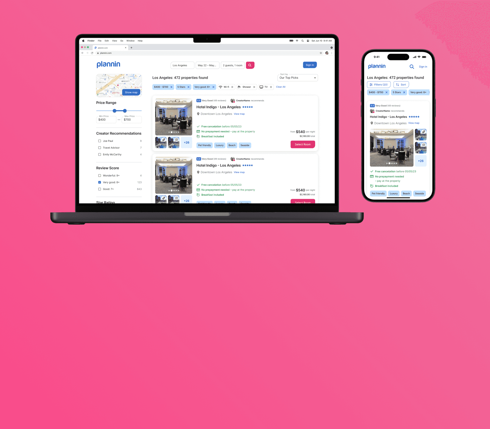
Solution Examples - room booking
The desktop solutions were similar, so I will mainly highlight analytics and mobile solutions.
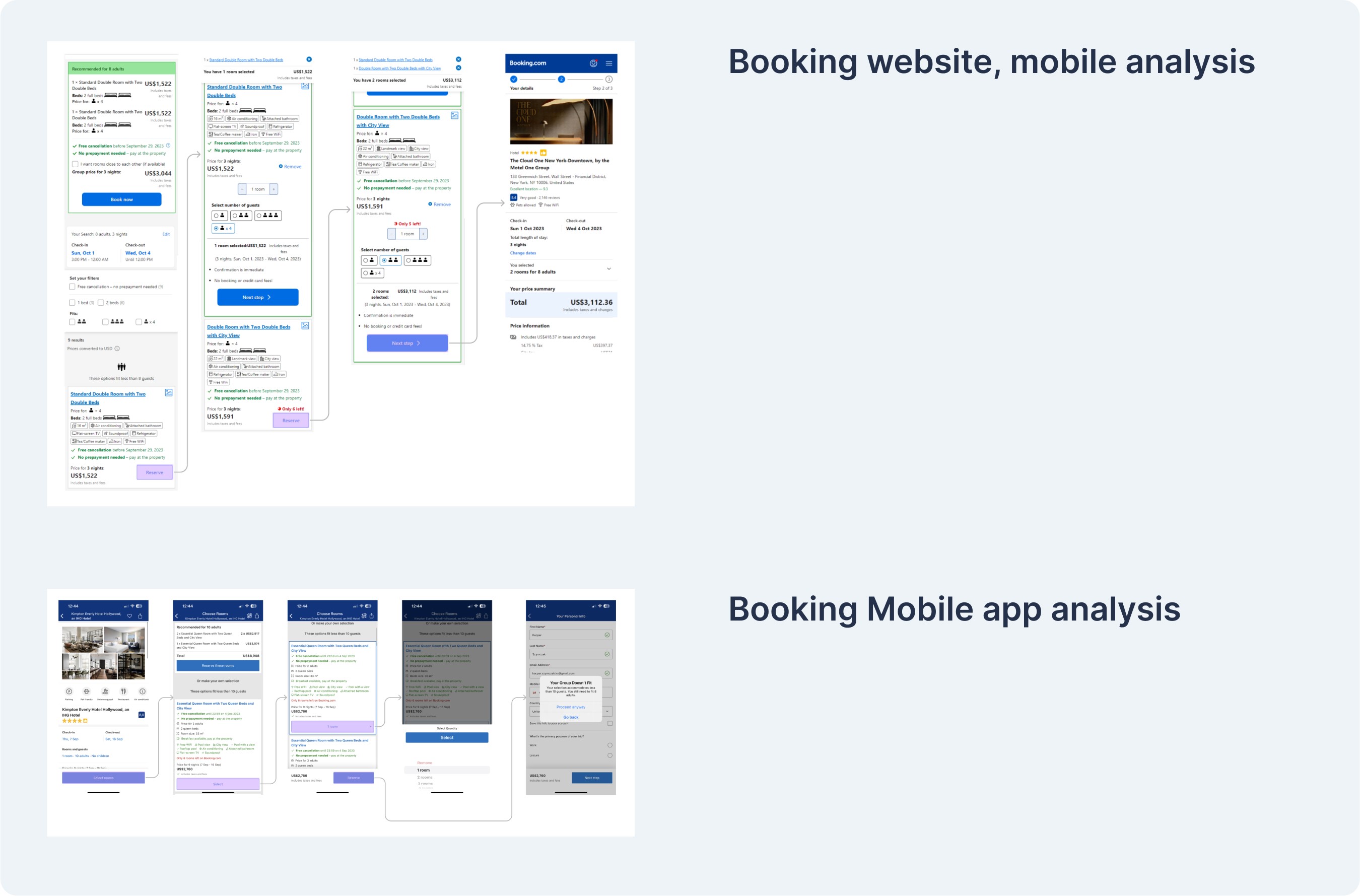
Booking.com - mobile website analysis
✔️ Users can select amount of guests per room
✔️ Users can select amount of rooms
✔️ You can see the number of rooms in the sticky-top bar
❌ Users can’t select room benefits.
❌ Users will get the most expensive benefit option when booking through the website on a mobile.
Booking mobile App
✔️The app will let you know if you don’t have enough room for guests when you want to cash out.
❌ The amount of rooms doesn’t stick to the top.
❌ Users cannot select how many guests go into a room.
❌ Users can’t select room options.
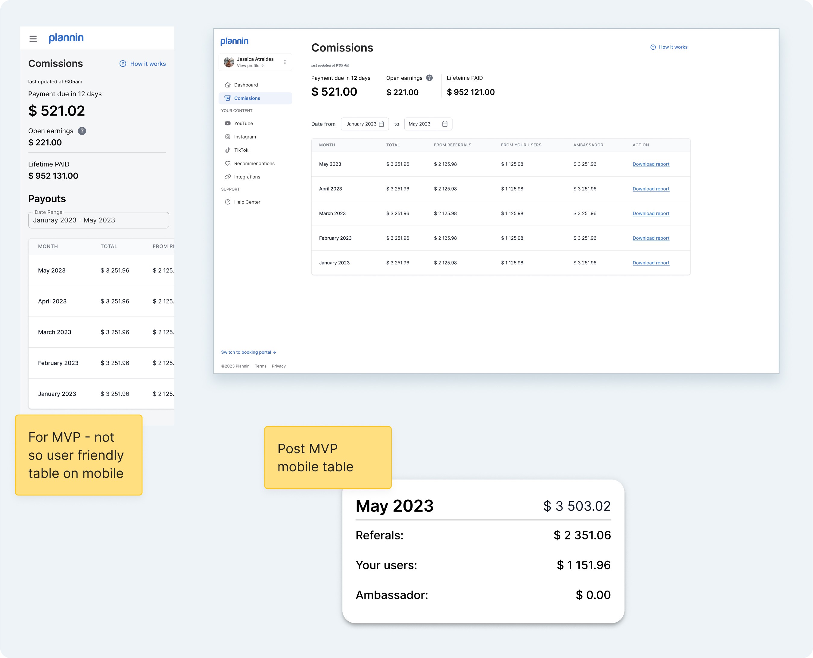
My solution:

Solution for Plannin:
✔️ Users can select amount of guests per room.
✔️ Users see the amount of guests to be placed in rooms.
✔️ Users can select different benefits for each room.
✔️ Users can select some of the same types of rooms.
✔️ We don't force users to choose the most expensive variant.
MVP was stripped of functionality because of API restraints. The user journey was simplified. After clicking the "Select" button, the user would be transferred to the summary screen because, for MVP, we could only book one room at a time.
Nevertheless, updating functionality to the proposed one will be very easy to do because all UI elements are ready for it.
Creator Dashboard

Notable changes between 1st version and the final one:
➡️ Referral links were simplified.
➡️ Warning became information.
➡️ Duration picker was separated from information tiles.
Creator Payouts
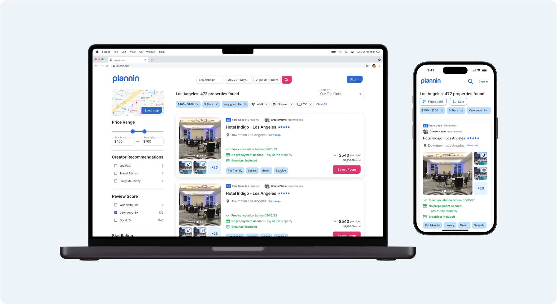
Search results
Due to technological limitations and the variability of filters in search results depending on the search term, analysis of search results and analysis of competing portals required more work.
Below is an example of how the filter dependencies were broken down based on the search phrase.
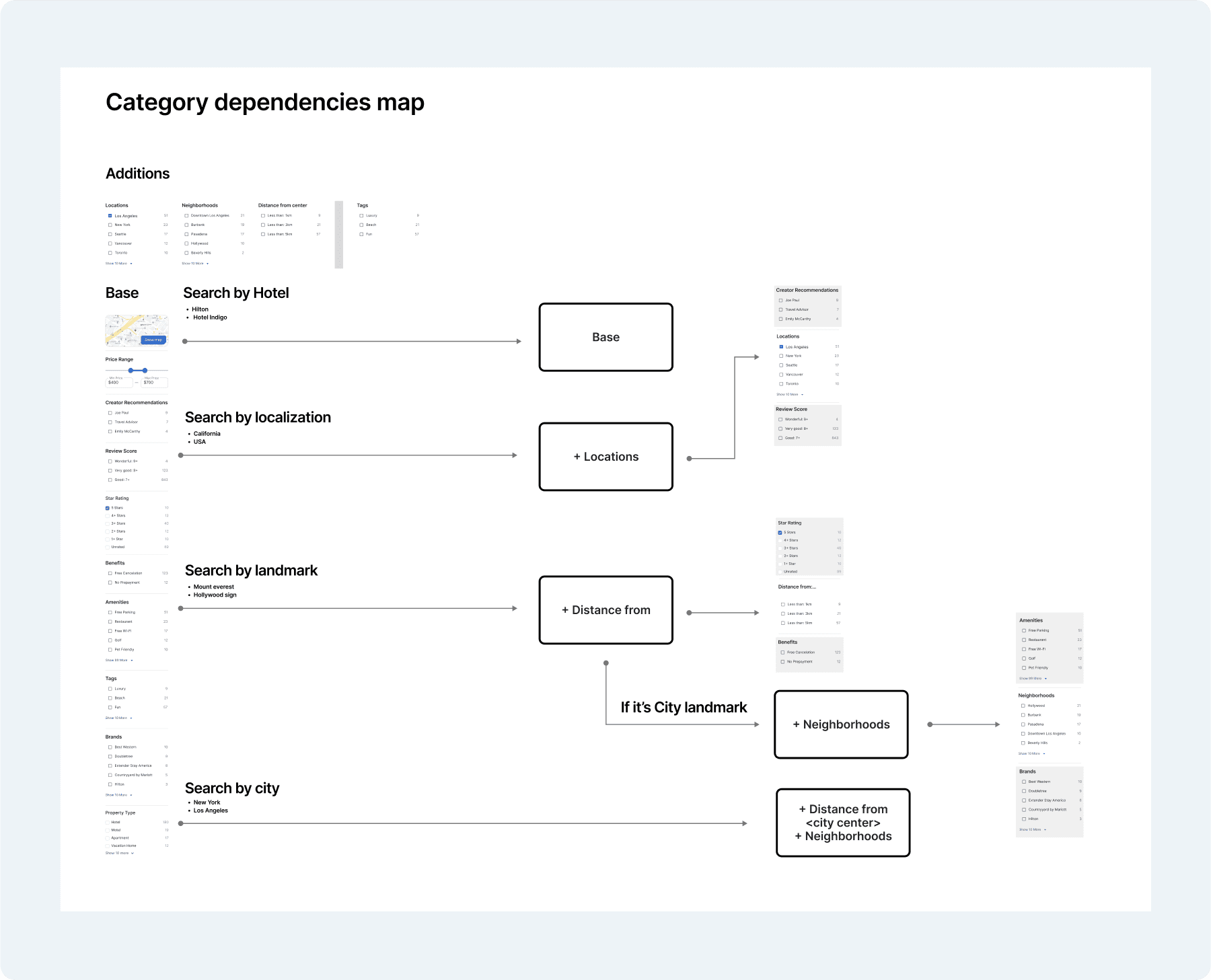
And UI representation on Desktop and mobile (the tablet version was very similar to the desktop one).
Creator mode
A mode for the creator to add his content from the hotel page.
Here, there were a lot of ideas on how to solve it. Ultimately, the simplest solution was the best, especially with an MVP in mind. Adding a "Creator Panel" button next to "Select room" on mobile desktops and tablets adds this button in the top bar.
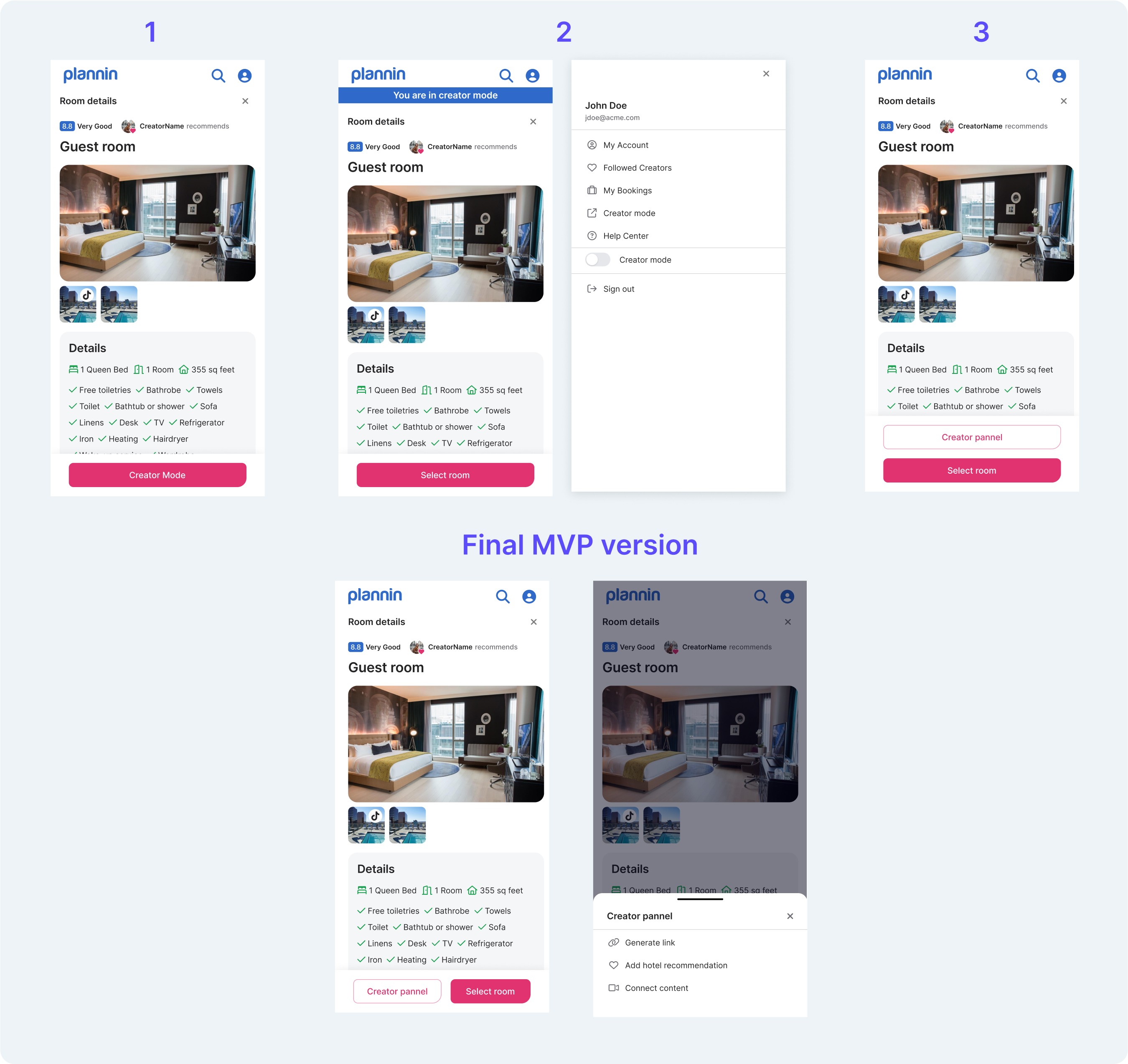
The first version didn’t allow the Creator to select the room.
The second version might be a good fit after MVP when the creator can edit his content from the hotel page.
With a sticky top bar and sticky bottom bar, we thought it took up too much space on mobile.
The simplest to apply and with the best UX for MVP was the last version with Creator Panel next to Select room in the bottom bar.
Evaluation and summary
The project is interesting and has many challenges, but there is potential for a really good app without dark patterns like the competition. There are many ideas for marketing and personalizing content in this app and in a cool way to bring the user closer to the creator before, after, or during the trip.
Research with users regarding UI elements was postponed until after the release of the first version of the app, which I generally agree with. The pace of the work required working on experience, intuition, secondary research, and iterations with the client. Discussing the validity and context of some solutions will be best tested on a live application.
What could be done better?
The discovery phase would, without a doubt, have been useful earlier.
An earlier decision on rebranding.
Better explanation and finding the golden mean between the first version of the site and not necessarily the MVP, or correctly redefining the MVP for this project.