TeaCode.io
4 months (ongoing project)
LyfePlan
Project Summary
The project consisted of workshops to verify the app's needs and determine what should be included. The app was intended to organize and store essential documents so that loved ones would know what to do in a life emergency. The user was intended to be US households earning more than $120k a year.
The most important thing for the project was to see if people see the need for such an application, to what extent, and to check awareness of the existence of competition.
In addition, the client hired several companies for the Discovery phase to decide with whom to continue the cooperation.

Team
Two stakeholders from the client
Designer (me)
Project manager
Researcher
Developer
Exploration & Problem verification
Ultimately, the application was supposed to solve the problem of organizing essential documents and safeguarding the user for life events. In the beginning, a sizable part of the team was skeptical about the project due to the market's existing competition and the amount of sensitive data that (we believed) users would not want to share.
To test the assumptions, we conducted user surveys on the userinterviews.com platform.
The survey consisted of 29 questions and was arranged by a PhD in sociology. Several essential things emerged from the study of 100 respondents:

As it turned out in the survey, our skepticism was misplaced. In addition, one stakeholder interviewed the owner of the competitor about whom there were the most significant concerns, from which it emerged that they did not want to expand in the direction in which LyfePlan was planned, which further reassured everyone that the project might make sense.
Personas - overlapped with stakeholder assumptions, so we didn't spend much time on them in this phase. We did them and moved on. Everyone knew who the potential user would be.
Information Architecture
The IA was created in iterations with LyfePlan stakeholders. We also used a priority matrix and user stories. I presented the iteration process below.
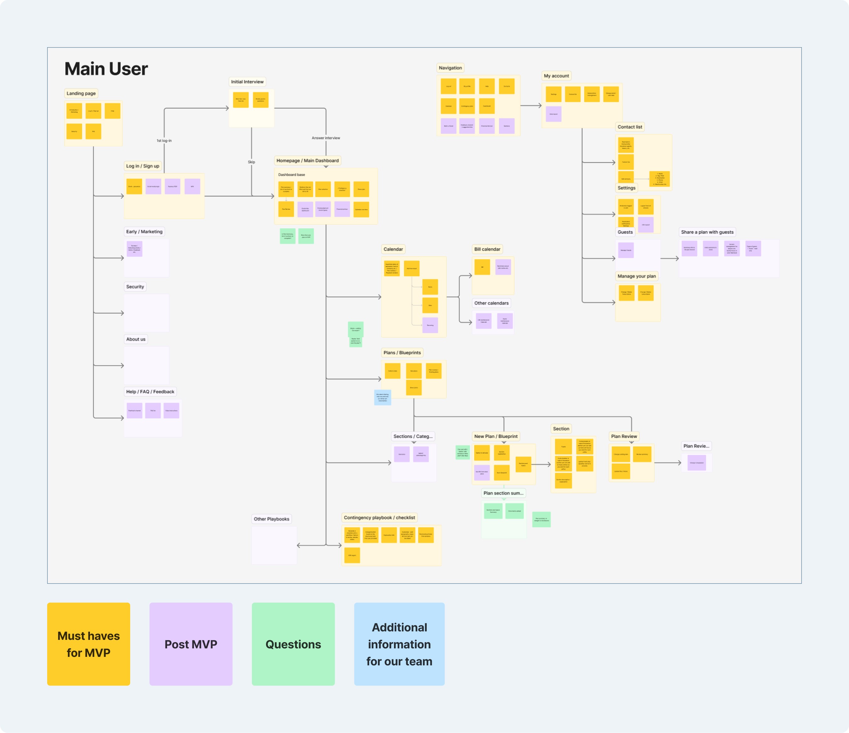
Iteration process
With the knowledge gained in the surveys and the determination of the MVP. The iterations looked more or less like this. Of course, depending on the situation, the order could sometimes be swapped.

Wireframes
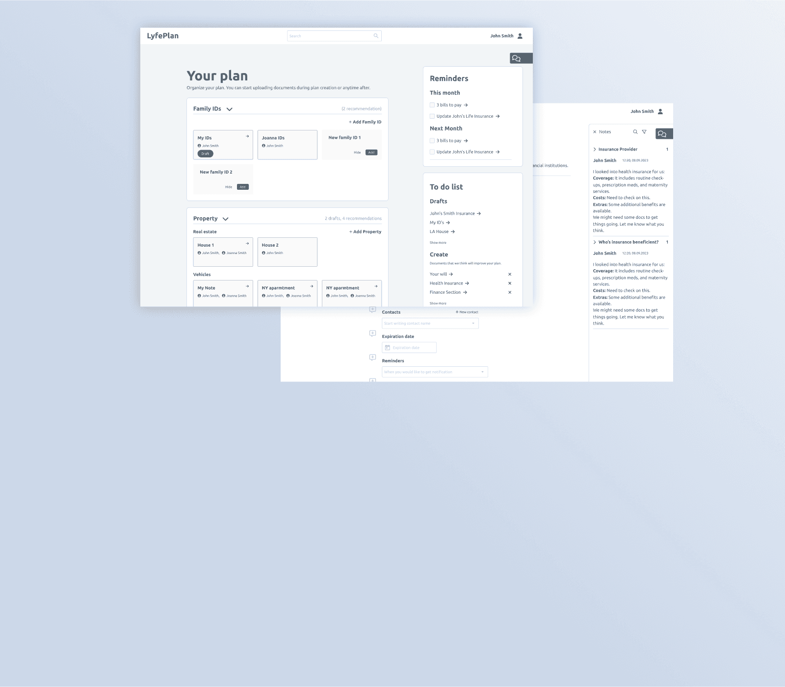
Because the project is ongoing, it shows only some of the more exciting solutions we have developed.
From global to local comments
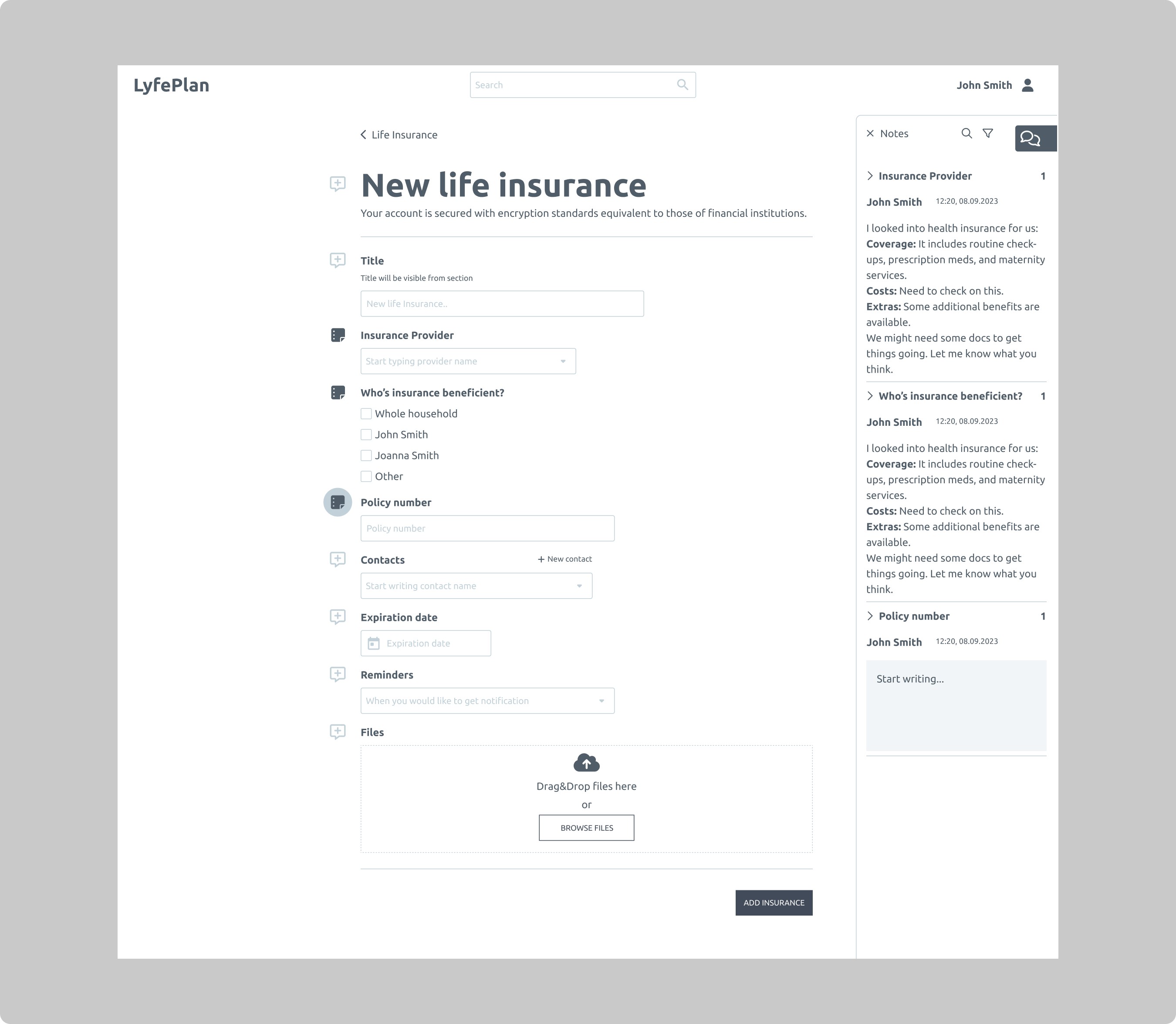
Global and local comments are on the right side of the viewport. Comments narrow down with nesting. On the main screen, we will have general information about the project, and while checking or adding life insurance, we will only have comments regarding life insurance.
In this way, we addressed the user's need to personalize the documentation and give freedom in the level of involvement in the application. Some, e.g., will want to upload a scan of documents here, while others will want to save only the most important data for them and, e.g., indicate that the documents are in a specific binder at home, safe, etc.
Comments have a similar form to those in, e.g., Adobe Reader, so they are easy to use when downloading the plan in PDF form.
Print option for a plan
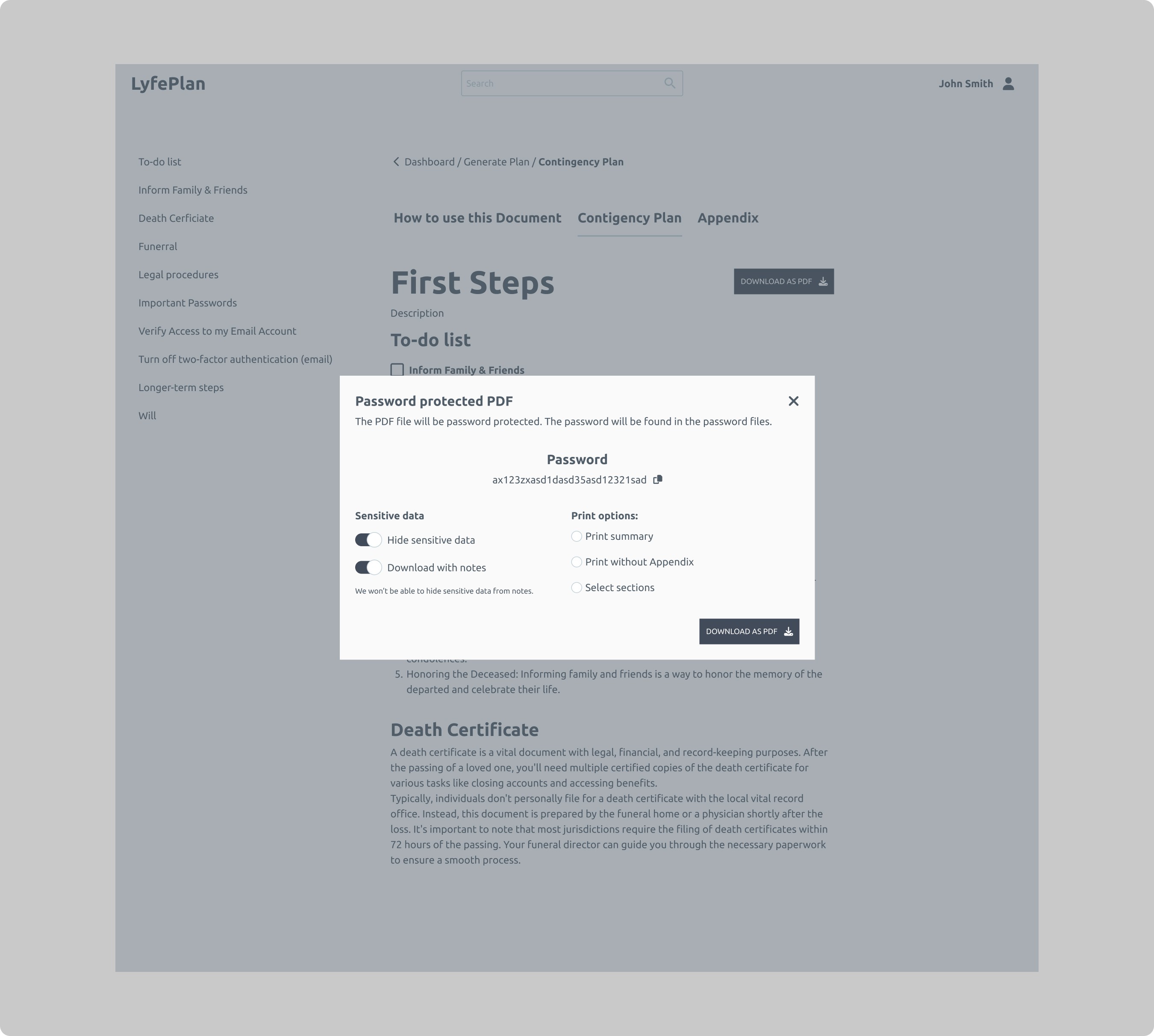
Keeping in mind the various options for printing a plan for life's situations, we had to give the option of personalizing the printing of documents. It was essential to address that we would not be able to determine the sensitivity of the data in the notes.
Plan editing
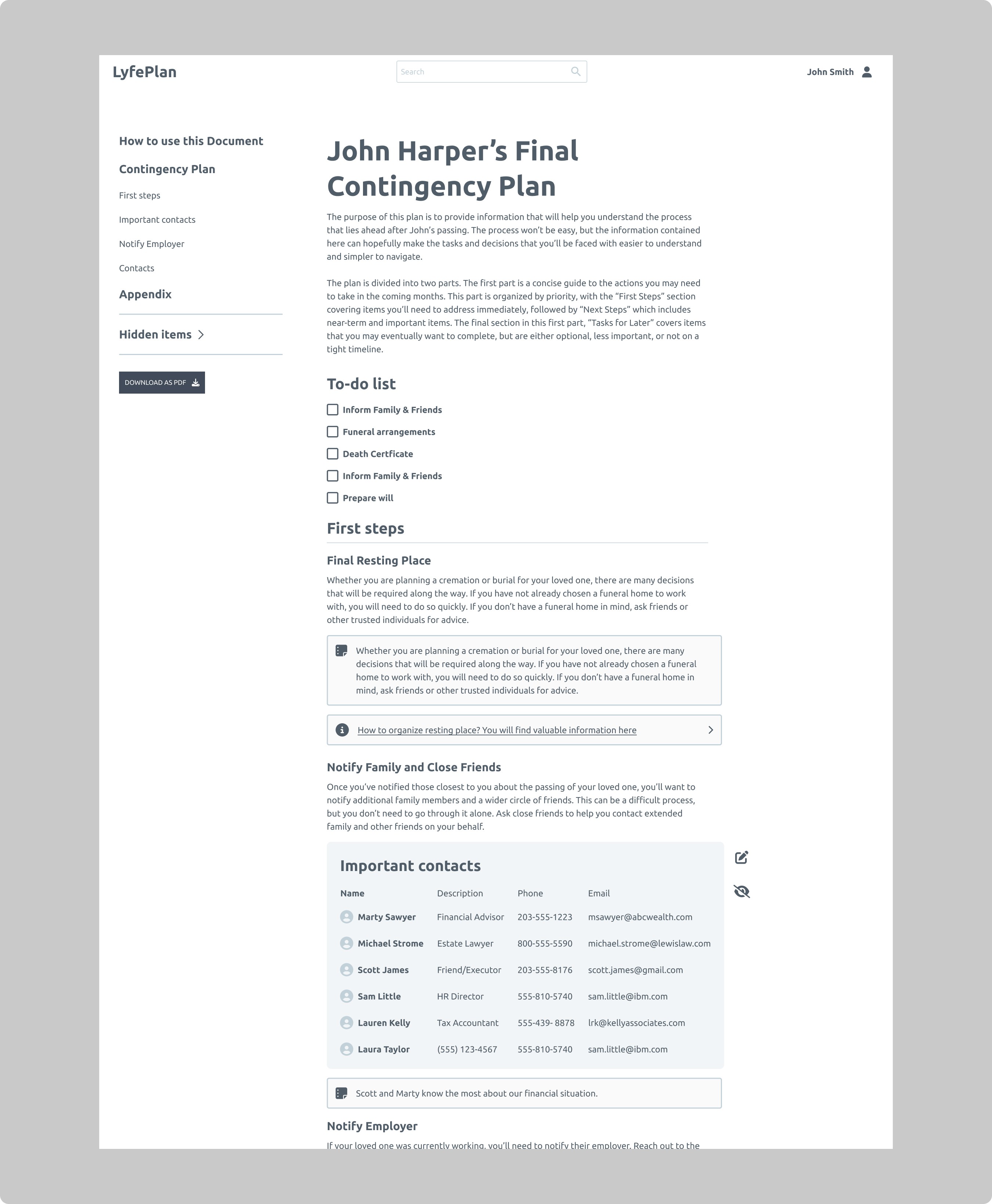
There are several types of information in the plan.
General non-editable
General generated based on uploaded data
User's notes
The plan was clearly divided into sections to make it easier to understand what is editable, what is not, and what can be hidden. The available actions are "On Hover" or Mobile when a section is tapped. The user can hide general elements. If necessary, under the main sections on the left, he can check and restore the elements he has disabled.
Evaluation and summary
This project was a very good example of how important research and belief in a project are. The research showed that the project could have a really good reception in the US market and, later, maybe outside the US. The result of the research also influenced the team's motivation to deliver the best possible solution and better understand the project.
At this point, I don't know if TeaCode was chosen as the company to develop the app, but I do know that the client praised us for understanding the app's task very well compared to the competition. It turns out that the designer doesn't have to be a user to deliver good solutions.
What could have gone better?
In terms of design and process, rather not much. However, from an organizational perspective, I must single out a few elements as lessons for the future.
Unfortunately, the project was on a fixed-price basis and exceeded the value of hourly rates, so you could certainly do a better job of pricing. For example, by contacting the people who will be doing this project.
Better handoff between sales and contractors.
Meetings at the beginning of the project were rigidly set so that sometimes there was nothing to show at the meetings.
