mBank
6 months
ITRun Consulting
Project Summary
Of all the projects I worked on at ITRun Consulting, this one was the best documented by me.
Because of the NDA, the following Hi-Fi mockups replicate the functionality, and the appearance replicates the layout.
The project was intended to help managers and directors in their daily decision-making. It was to gather a lot of data from many sources in one place and show it clearly. The project also came closest to an "ideal" UX process but wasn't perfect. The only thing missing was measuring the impact of this application in quantitative form.
Team
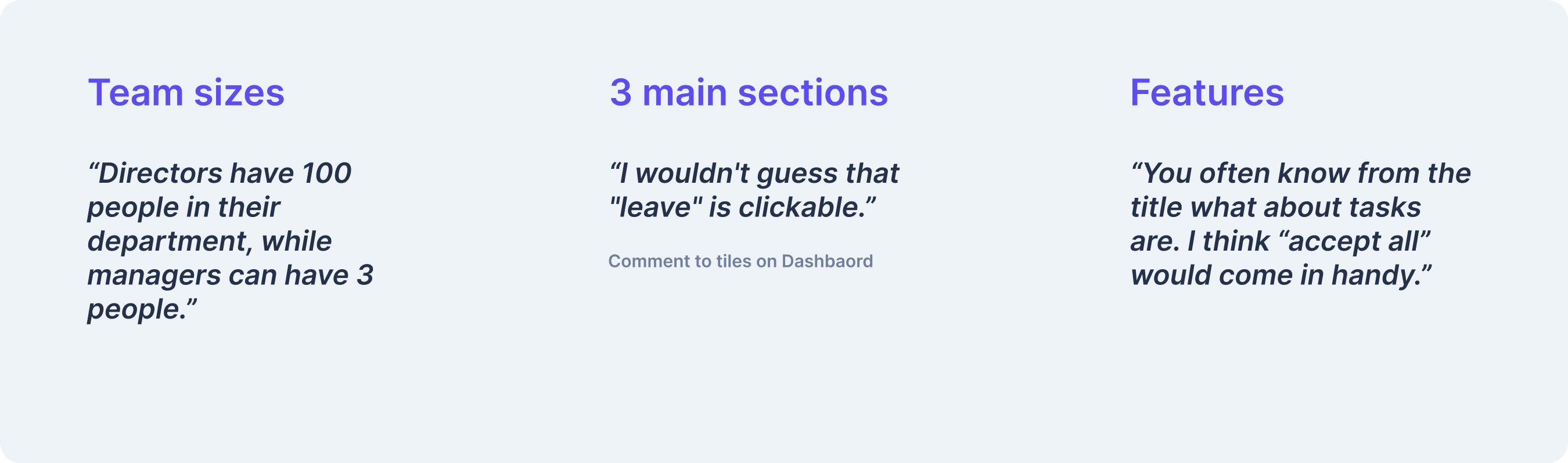
3 Managers / Directors
4 devs
1 UI / UX Designer
Multiple users/stakeholders
Exploration & Problem verification
The requirement for the application came from the managers and directors themselves. To check the source of the problems, I did several interviews with managers from different departments and in different positions.
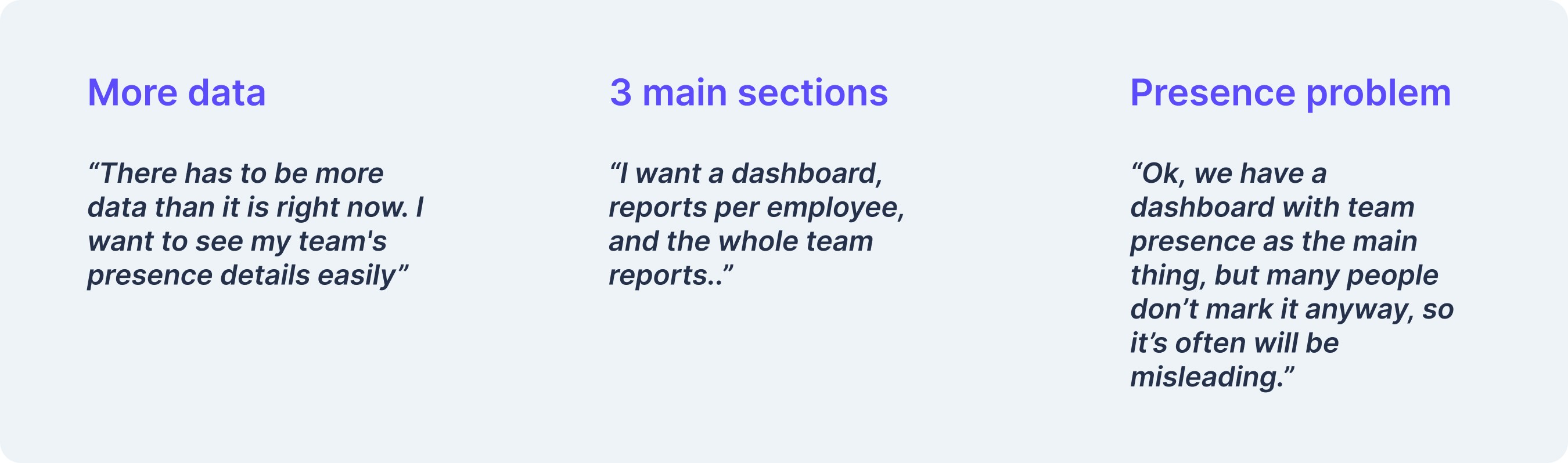
Main observations:
Better and more data
Splitting the app into three sections
Some managers won't have any use of the app
Better IA is needed
A lot of people don't mark their presence
The problems were confirmed in interviews, with a tiny detail: branch managers use schedules, not attendance lists. After discussing the problem, we decided not to address this need in the first stage.
Not marking attendance was charged to managers. However, in my opinion, it would be an interesting idea to apply the Service Design approach.
Process in a nutshell
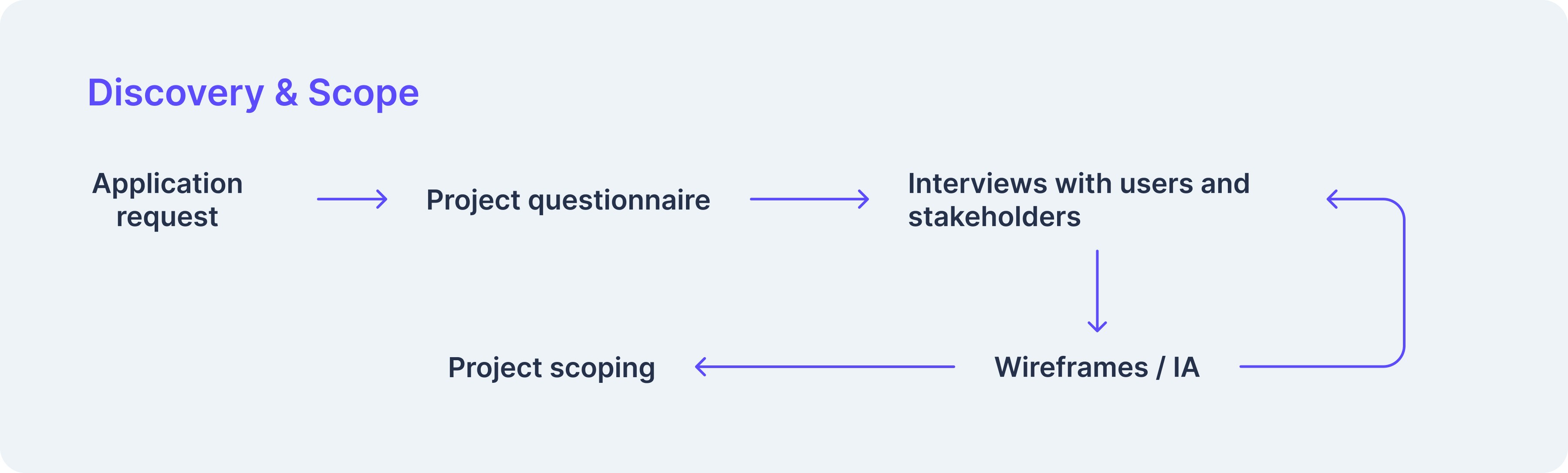
Based on my discovery, there was a budget for the project and an estimate of the project's work hours.
The main difference after the estimate is the greater involvement of the developers.
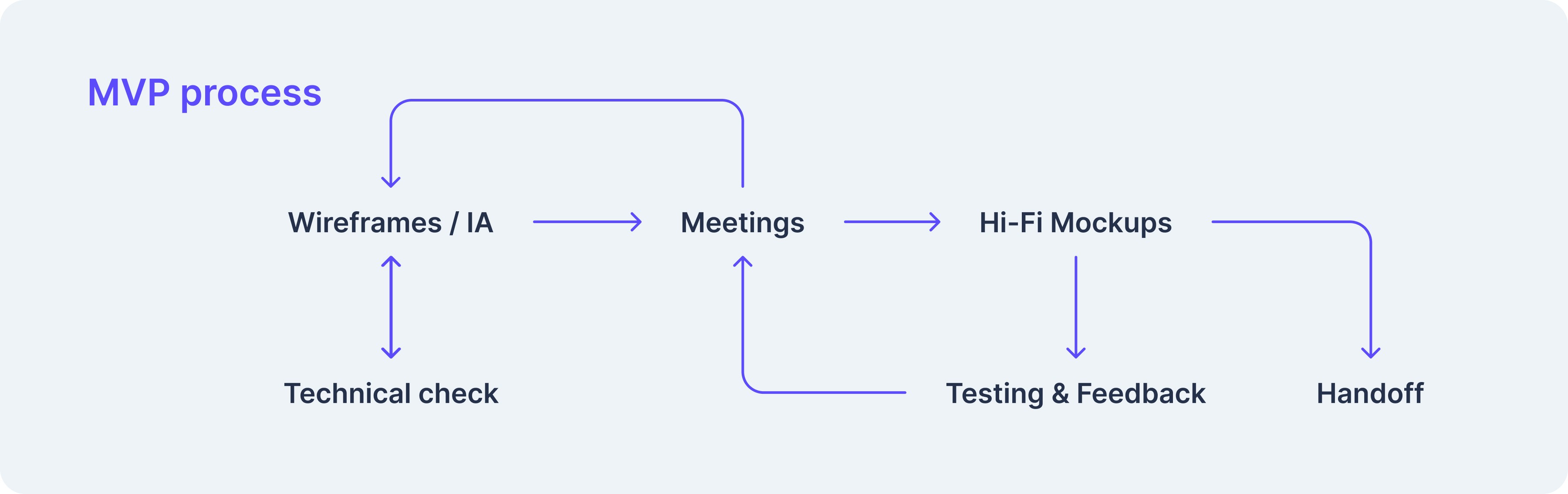
The process is approximate; things did not always go smoothly and perfectly, and the order was sometimes changed.
The intentions were good, the need for applications was there, the problem was the number of managers and their individual needs as well as their ideas. Each director and manager wanted something for themselves; not everything was feasible or fit into the overall application. As is usually the case, each director claimed that his department was the most important.
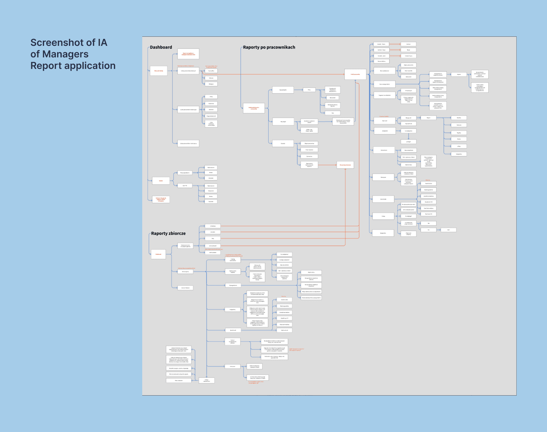
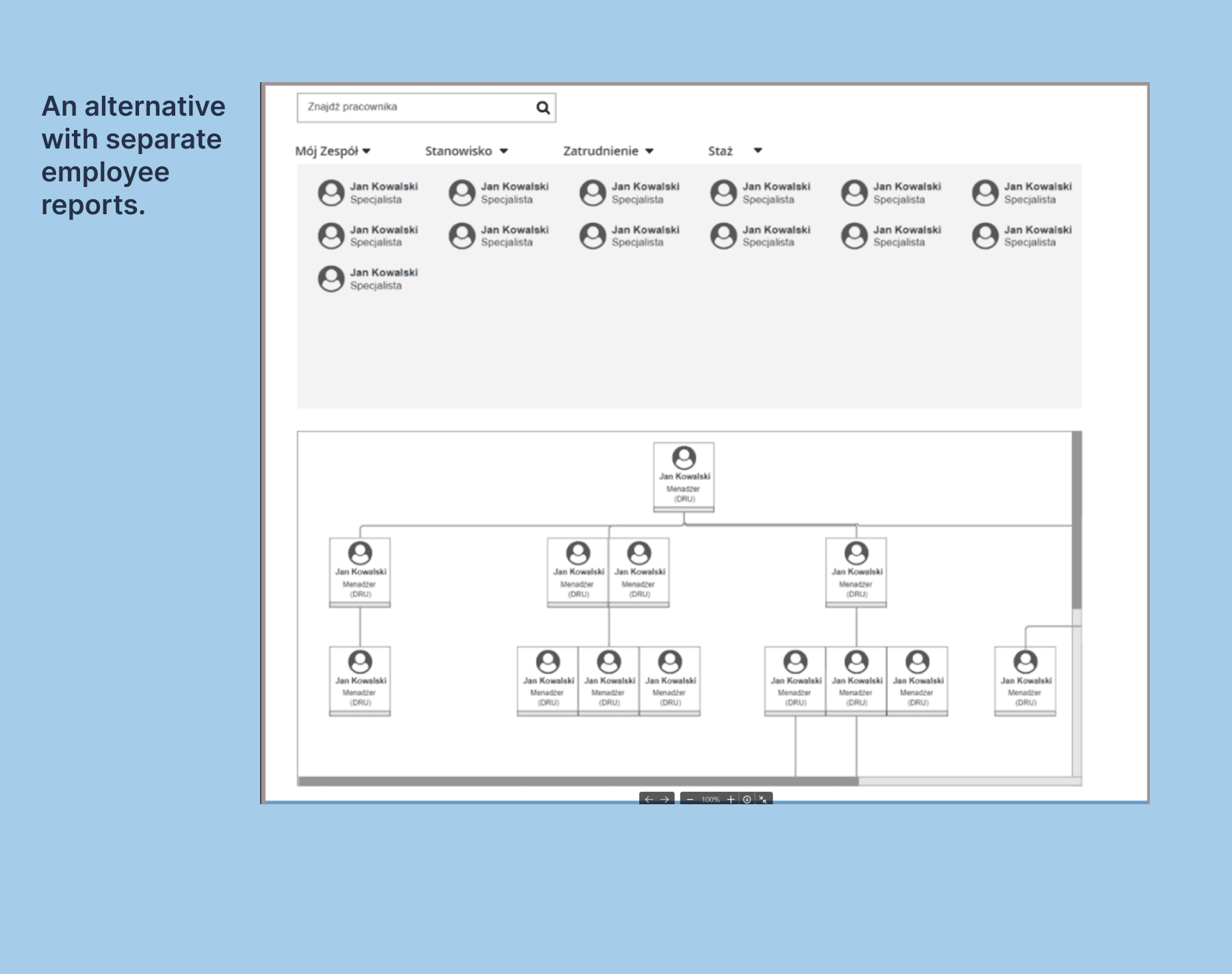
Information Architecture
The IA has been revised several times due to feasibility and actual demand for specific application functionality.
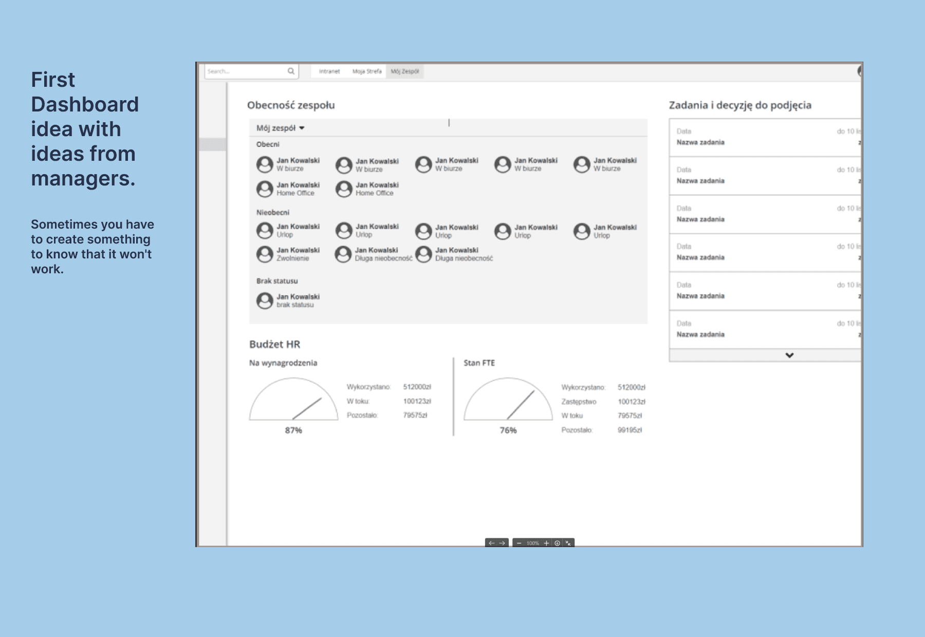
Wireframes
The first ideas were created quickly with a check of functionality coverage. We tried to get answers to these questions:
Is this really what we want to build?
How do we want to divide the information?
Where should the information go?
How should the application look and function?
Example of wireframes:
Additional Feedback
In developing more wireframes, checking functionality, and more conversations with managers and directors, additional elements influenced the final design of the application.
To sum up feedback:
The budget should be visible only to directors
Better visual hierarchy for users
Some minor UI fixes
Some additional features
Dedicated interface for Directors and managers (Different team sizes)
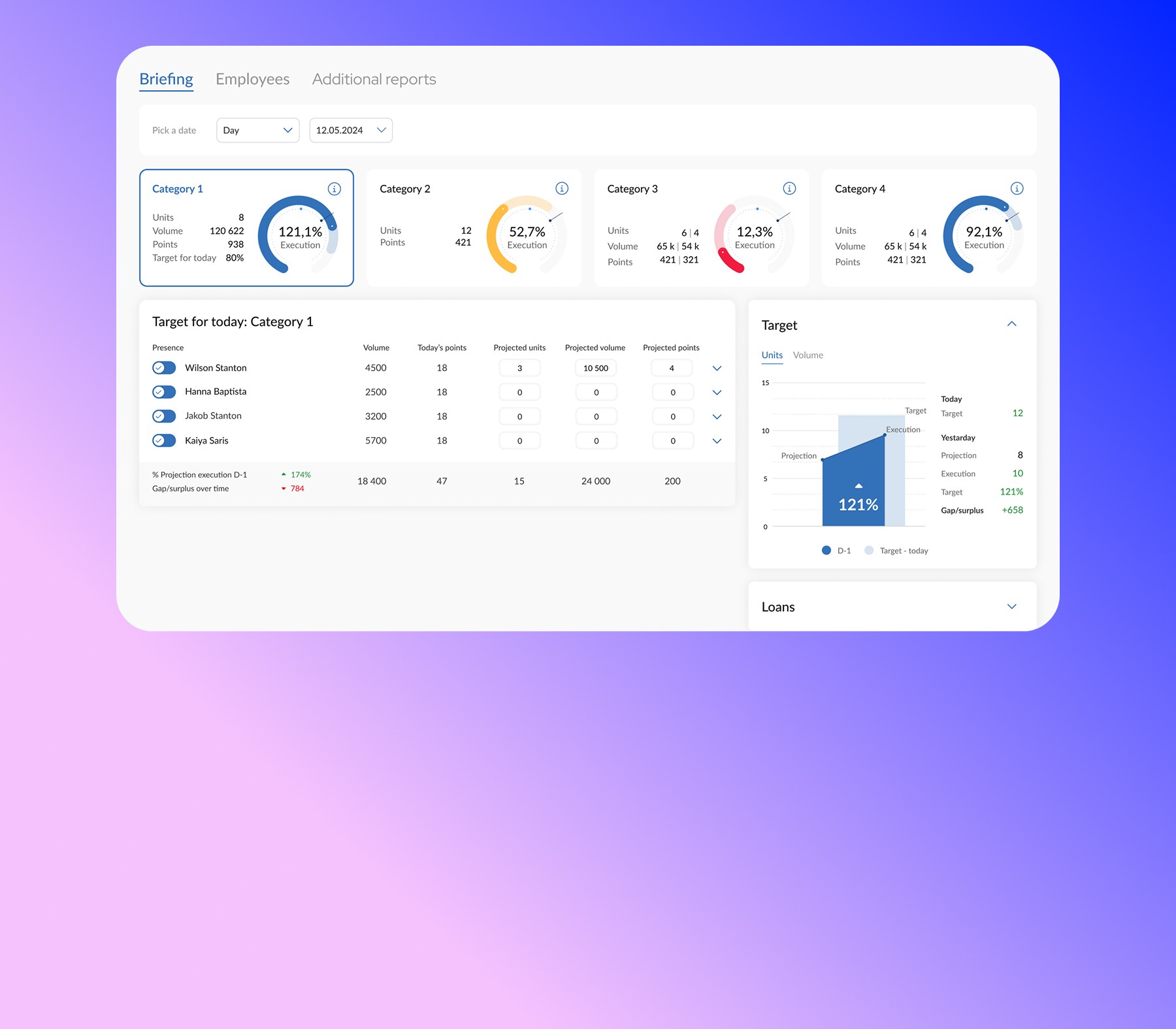
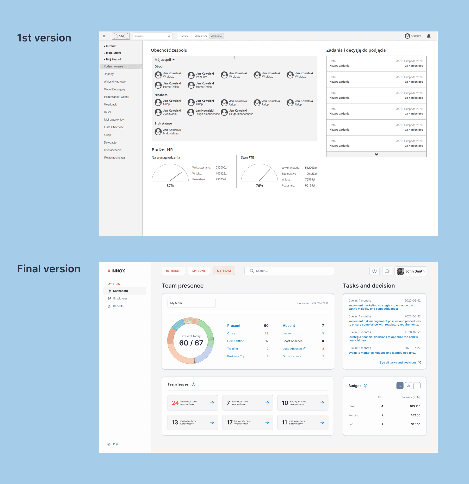
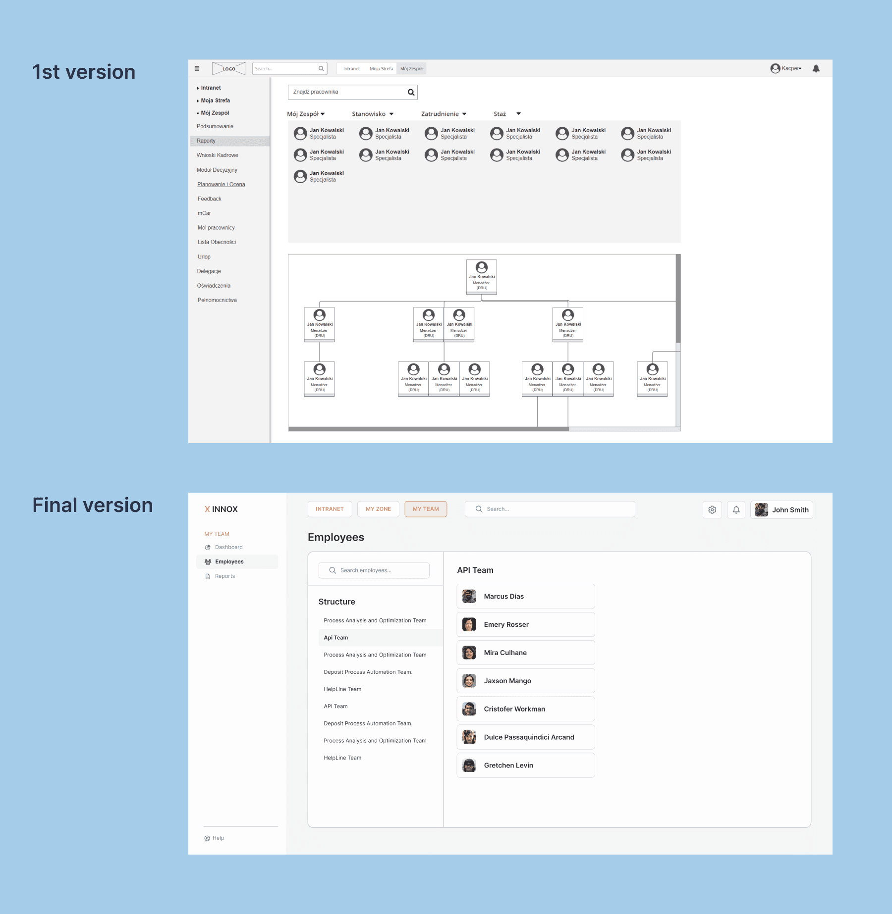
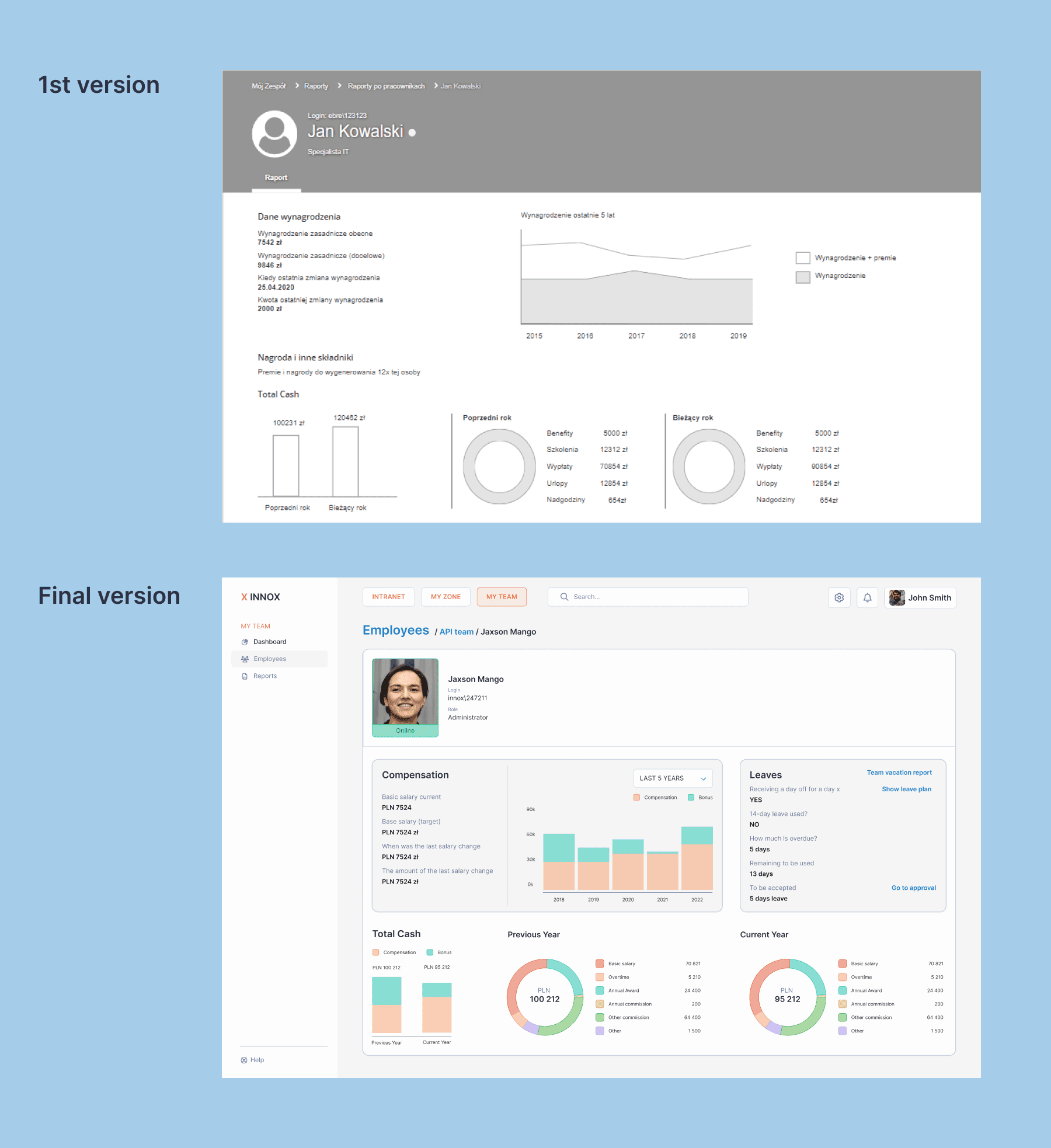
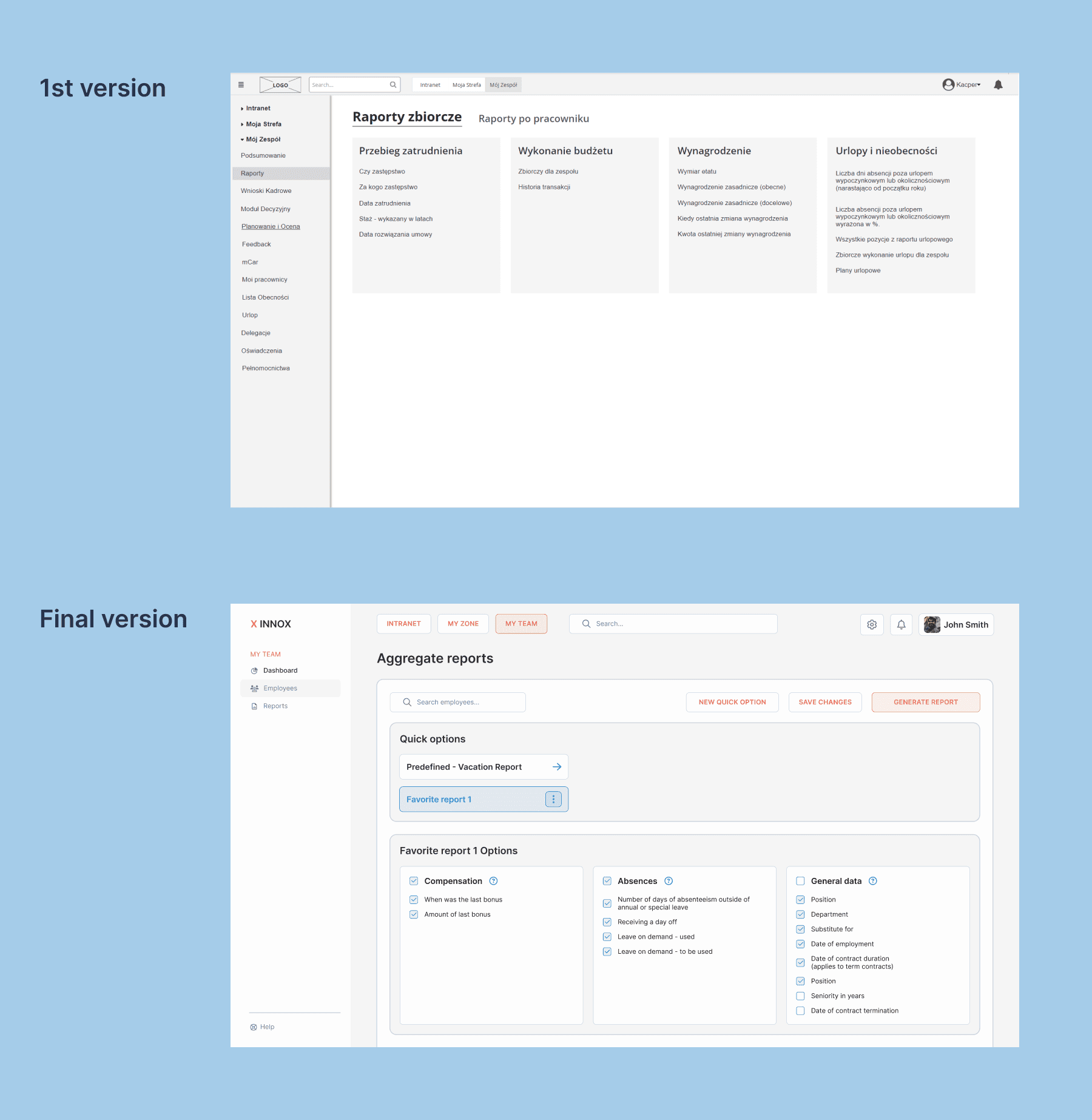
The first version vs the final version.
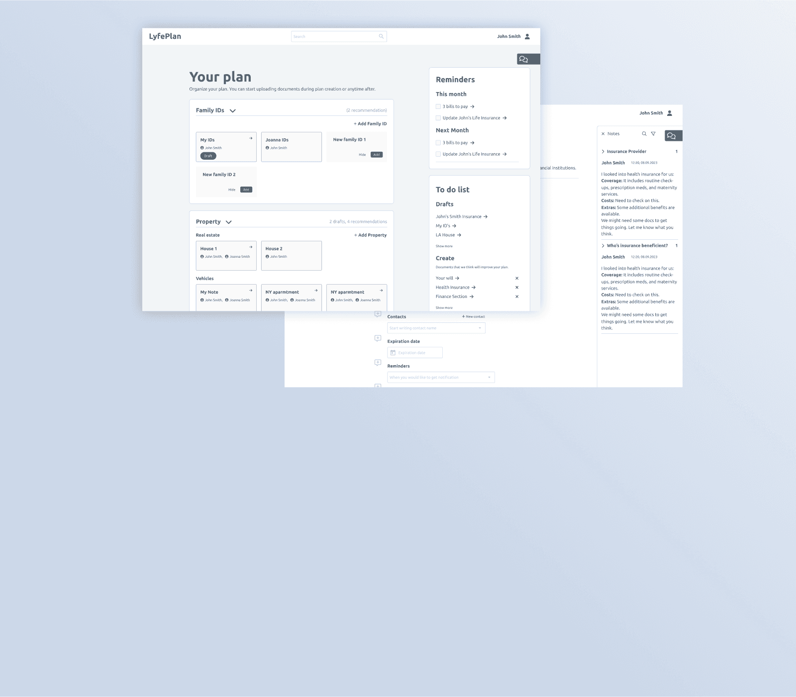
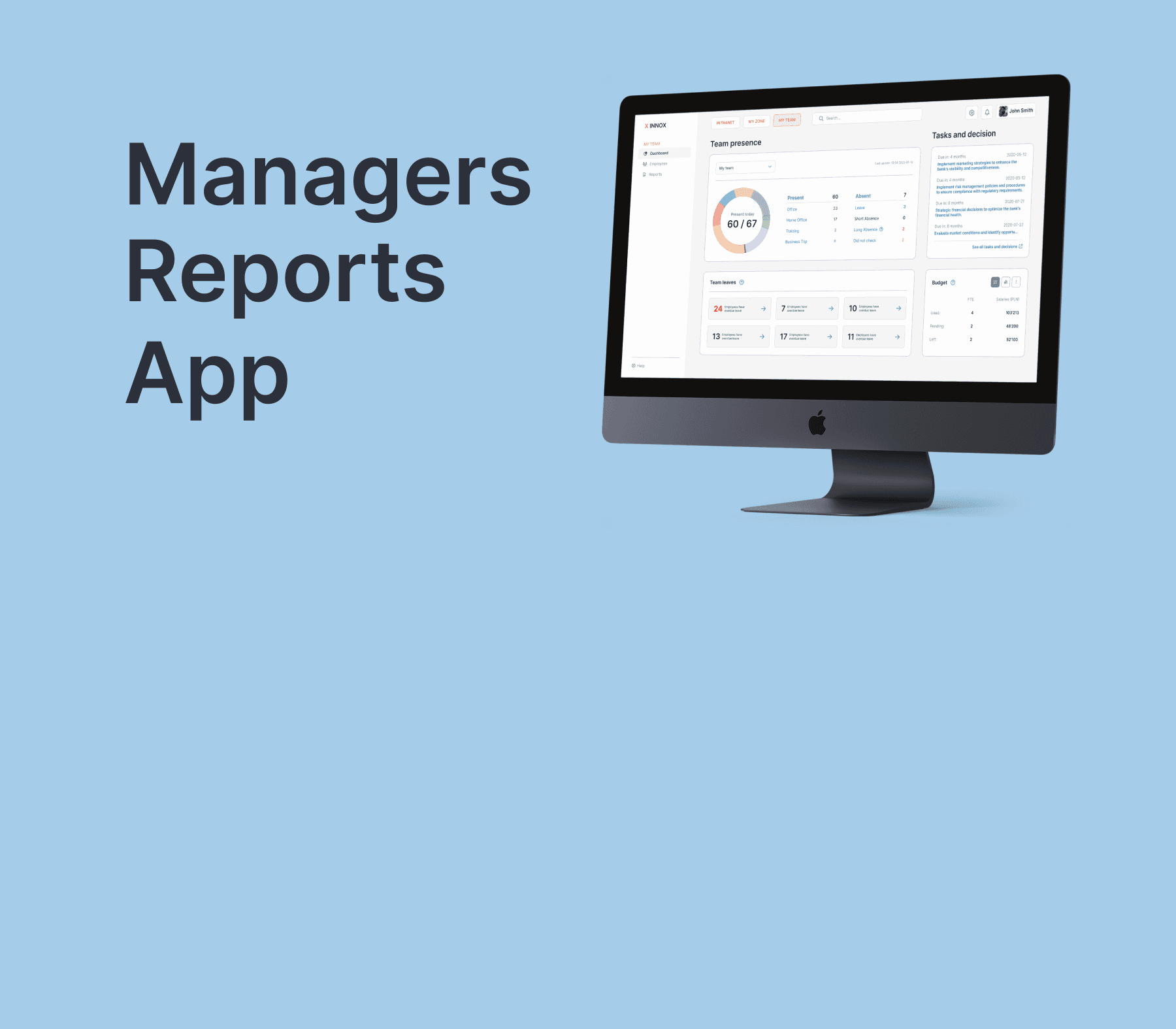
Below, you will see how the first wireframe changed over time to the final version. I've let myself translate mockups from Polish to English. Also, as I mentioned before, the design perfectly represents the features and hierarchy of the app, but it comes with different brands since I can't use the mBank design. The app went live with presented solutions. I would link you to the app, but it's impossible since it's a back-office solution.
Dashboard
Employee search
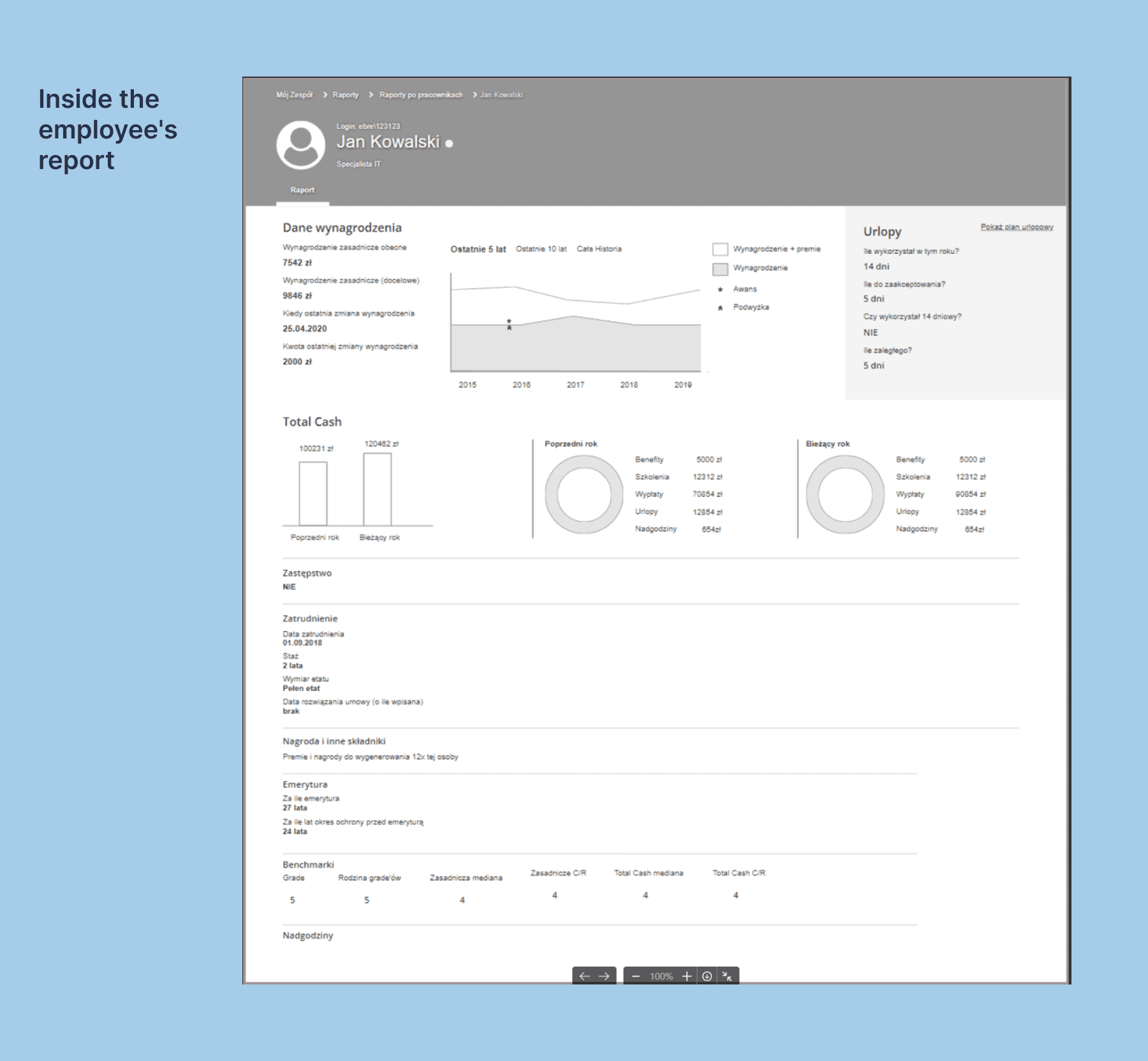
Employee reports
Aggregate reports creator
Evaluation and summary
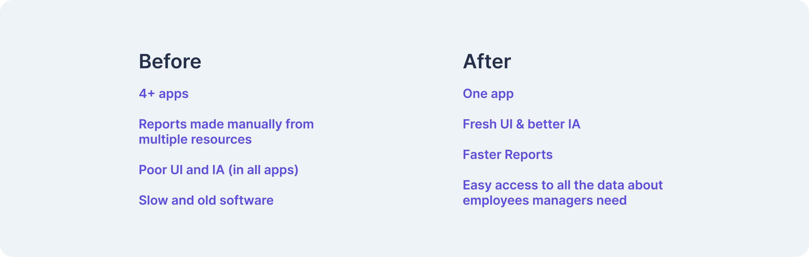
The whole project had a very good process; there was proper Discovery, proper scoping, and execution. Very good and iterative cooperation. The only thing that was lacking, and would be just a nice addition, is a quantitative comparison of before and after. We still know we did a good job from user feedback.
User Feedback
For various reasons, quotes from users I had the pleasure to talk with are the only way I can present that the app has reached its initial goals.
“Overall, it works very nicely and has already helped me with various topics over these few days.”
“The app looks good, cool.”
“There is so much data in one place, nice”
“I made a few important decisions based on these reports on the first day I had access.”
UX is never done.
Generally speaking, the app could be even better with the following:
More control to the user about the interface
A few features that users asked about, like “accept all” in Tasks and Decisions
Better search for employee
Making a presence Service Design case instead of leaving it to the managers to write to their employees to mark it